


![]() Sun Mar 17, 2019 6:38 pm
Sun Mar 17, 2019 6:38 pm
Re: Zeropainter - GFX
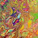
Very cool, Zero! I think, Mike will appreciate it, too!  ...plenty of details.
Showcase your Verve Art to all ages!
![]() Sun Mar 17, 2019 6:38 pm
Sun Mar 17, 2019 6:38 pm
![]() Mon Mar 18, 2019 3:21 am
Mon Mar 18, 2019 3:21 am

Posts: 1291
Joined: Sat May 31, 2014 12:35 pm
![]() Sat Apr 27, 2019 6:00 pm
Sat Apr 27, 2019 6:00 pm

![]() Wed May 01, 2019 12:31 pm
Wed May 01, 2019 12:31 pm
Posts: 1291
Joined: Sat May 31, 2014 12:35 pm
![]() Thu May 02, 2019 9:20 am
Thu May 02, 2019 9:20 am
![]() Thu May 02, 2019 9:38 am
Thu May 02, 2019 9:38 am
Posts: 1291
Joined: Sat May 31, 2014 12:35 pm
![]() Thu May 02, 2019 10:35 am
Thu May 02, 2019 10:35 am


Posts: 1516
Joined: Sat Mar 29, 2014 10:49 pm
![]() Fri May 03, 2019 12:32 pm
Fri May 03, 2019 12:32 pm

Posts: 1098
Joined: Mon Jul 07, 2014 9:51 pm
![]() Sat May 11, 2019 9:31 pm
Sat May 11, 2019 9:31 pm
![]() Tue May 14, 2019 4:01 pm
Tue May 14, 2019 4:01 pm
Users browsing this forum: No registered users and 13 guests


